Friday, 28 February 2014

The Sauce, further branding development:

At this stage, I was instructed to further develop "The Sauce's" Branding as the group felt it was the strongest idea, so we decided to develop the logo.

I began by working on the original banner created in illustrator. 
Our research had led us down a path of using a mint green colour to symbolise a Fresh new company which releases the most up to date news.

The banner had been slightly edited by adding green to the sides, which was a starting point.
These above are two simple labels that could be used as branding in our design, the group went for the banner in a blind attempt for something that looks good and then I had a look at sauce labels and what stuck in mind to me was the limited edition ketchup bottles which contained a green sauce. I found the image on google images and based a label on their existing one.
I still decided to illustrate out the banner logo just to see how it could be developed and how it looked inline with the theme and colour scheme.
I chose to use a brush stroke which used dots instead of a line, this looked really effective and nullified the overpowering way that block colour has on a logo. I liked how this looked, but in the back of my mind it made me think of an ice cream parlour yet again, and green mint ice cream balls.
I also made the decision to go for a Charcoal colour and in conversation with the group, they liked the aesthetic of the tone and said it could be used as the body copy font on the webpage and other mater which we create.
Lobster font was chosen by a team member, and I've chosen to carry on in this instance, but it could be refined deeper in the future.
I had mocked up a larger logo using grid lines, and used a vector of the shape of England in my mind colour tone, to show that the news company was based on British news, I intended for the UK shape to look like a sauce stain/blob, but I can create that in the future if this project goes further.
Here are the final pieces of branding that I am happy with.
The Sauce label has been created with dots for lines and also a full line to see the different effect on composition it has, a lot more stern and demanding I feel.
I applied the label design to the vector of the British Isles, I was happy with how this looked but feel it is representing the wrong message, and looks like a logo for 'Sauce of the country' award or such.

I was pleased with these creations, but felt they'd need backing up with a tag line or such, and in theory a logo should be able to work stand alone, without font. 

Branding sketches for our project proposals:

For the interim critique, as a group we each sketched up 
Tongue twisters:
As a group we decided to create formal and informal design ideas for each project that had been proposed.
The formal creations from the Tongue twisters idea involved abstract T's which twisted and had been manipulated.
I decided to bring a cartoon like tongue to the shape to make the logo less formal and intricate, and more conceptual to what the project was aiming for.
Also a mouth with a tongue coming out and twisting, had potential to be in Gif format, but this was very juvenile. 
Only simple ideas for the sauce which I sketched up, various placements of type and a typeface that could work in a formal way, as inspired by the tabloid newspaper research.
These are the group's contributions to the Sauce's initial branding. 
They left sauce bowl idea is very juvenile and without explaining how the company is a news business, it wouldn't be evident which company it was representing, most likely a cafe.
The right design uses a hierarchy format, but in my opinion two fonts which aren't very engaging or aesthetically pleasing or correct. 
Jello was also a name for our news proposal, it came from the idea of Yellow Journalism, and the juvenility behind a great yellow jelly and attempting to see the news through this, hence seeing the news with a comical twist. 

Team members logo contributions:
Sauce using a banner again gives the feel of a catering establishment, but it evokes a rather elegant feel, I don't massively feel this is relevant or explains the news concept very well or visually represents the company.
The Jellow/Jello ideas were very similar to the route that I went down my self.

We had a range of branding routes to go down for our proposals in the interim crit, It was my task to explain the concepts behind the logos, and the method of direction which we could develop the pieces.

Presentation for the Interim crit:


We had used Prezi to create a presentation to display our concepts for the crit in a coherent way.

Our attempt was for the presentation to last around 20 minutes and each the group members would cover a separate topic, and we would evaluate by allowing the crit group to inform us which proposal they felt was the best, and which we would develop over the remaining week.

Wednesday, 26 February 2014

Second group meeting:

As a group, we organised a second meeting to collaborate all of our individual research together.
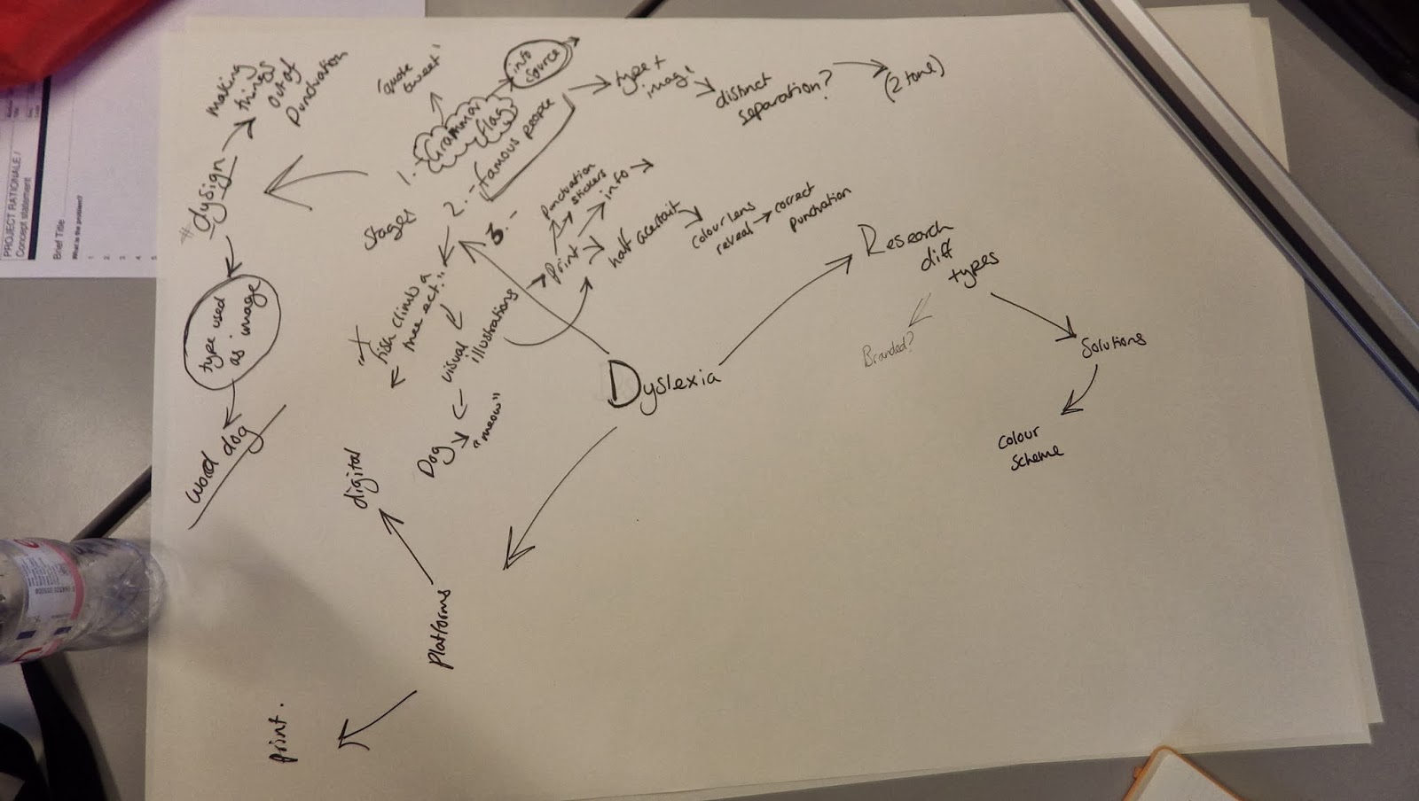
We eventually decided to go down the route of dyslexia in a way that we would target a much greater audience where then we would inform masses about dyslexia, how dyslexics had an incorrect stigma attached to them and how you could identify your self as being dyslexic or not.

We would use the medium of Twitter to flag up people's bad grammar, in a satirically and jokey way, which then using the twitter page we would suggest links to our created website which could inform about dyslexia.

We thought of comical things such as the 'dyslexic dog' which could be a mascot for the campaign, and also ventured down the path of created eye-catching and informative pieces of design that attempted to straighten out the stigma attached to dyslexics.
As a group we looked at existing pieces of art targeting the dyslexic community and those unaware of the condition. We found colours which benefitted dyslexics and typefaces which helped.
We had a lot to go on from this meeting in a way to progress the idea forward, include a range of interesting adverts and story boards which tried to de-stigmatise the topic of dyslexia, which I felt would be very effective as a viral campaign. 

Brief analysis as a group:

Being set the latest brief on viral campaigns and how best you could communicate a message, as well as our group being given the task to encourage people to 'Read more...'

From this task of 'read more' we wanted to think more outside the box than going down the book route, well specifically I did.
Facial expressions campaign
I suggested how the campaign could be about learning to read people's facial expressions better and with more clarity, this could benefit a campaign such as anti bullying in a way of 'don't read someone by their appearance' etc, could potentially benefit the school community and cut down on bullying.

Collaborative book
As a group, we had an idea to try to and initiate a collaborative novel/story which the public would send in their addition in how the tale develops, and hopefully, after a number of contributions, it would form a coherent story, which was fluid and entertaining. I suggested how we could attempt to get a celebrity endorsement as a biting point and an incentive for young writers to get involved and work with the project.

I was suggesting how we should ensure that the education factors ran parallel with the entertainment to confirm that the public were actually spreading this message of informative education. The entertainments or comedic value would be the method of transport which the informative 'educatory' material that we would research. If the levels of information over power the entertainment values, then no one will pay an interest, certainly not a target group of young adults, where as if the entertainment factors exceeds the levels of information, then there can be no actual message but have created something fun or interesting to see, for the wrong reasons.


We each had a designated task to research from this primary discussion, It was decided that I would research facial expressions and I suggested that idea from the start as I was against going down the book route.

We all individually would research viral campaigns and forms of communication.

Friday, 14 February 2014

Vinyl sleeve printing process:

As a way to finish the brief, after submitting my designs, I decided to digitally print my vinyl sleeves onto gloss paper and using tabs on the page, fold over to produce a 7" vinyl sleeve.
Stock choice:
I chose to use a glossy, photo paper stock as I felt it would give Lorde's sleeve design the best out come, knowing that glossy paper had a high quality finish and colours were deep and rich on this stock.
Lorde's vinyl sleeve looks very professional, once printed, in my opinion, the colours have lots of hue, are deep and rich, and the photograph is excellent quality and has a great brightness and contrast to it. 
The Black Sabbath design looks very good quality also, with the shining gloss making that black and white contrast even more evident.
Ideally I would have preferred to print this design onto a different stock, which was more fitting, but Gloss stock is fine for it's function at the moment.

Problems encountered when printing
After printing and cutting out my piece I noticed that it had various light pink lines running vertically down the print, I wondered why this was and asked the print technician, he offered to re print me my piece, but because a printed version isn't a mandatory requirement and the lines are only very faint, I refused. 

After using spray glue to stick the vinyl's tabs together, I decided to use a wet wipe to remove the excess glue from the design, the wipe must have contains too harsh chemicals, which were eating away at the ink on the gloss paper:

Thursday, 13 February 2014

Final uploads:

This design to show that Lorde is behind the diamonds, trying the look past them, in a wider, deeper meaning, Lorde dislikes the celebrity/modern day diamond lifestyle, and she sings about how not everyone can have that, in her songs, so for this reason this design shows Lorde physically looking past the diamonds, as they are not something she wants.

 Lorde does is differently, in my opinion it appears as if she makes songs to sound charty, but then the lyrics are communicating another message, which almost is trying to show the modern day isn't what it's made out to be in other songs, and not every person has the royalties and riches in their lives. This theory also matches up with the mood and lyrics found in her other song, Royals.

 The colour choice has been considered in relation to the concept and also how Lorde seems to behold feminist views, therefore the pink and blue girlish diamonds aren't something that she'd be impressed by.


Imposing my design into context

I have imposed my Lorde design onto a secret 7 album cover to see how the piece would look in context. I have used various photo manipulation methods such as skew, distort etc etc.

My vinyl record sleeve looks in context next to the other singles of last year's exhibition at Mother.

Wednesday, 12 February 2014

Feedback from a non creative:

I have realised that it could be beneficial to my work if I attempt to receive feedback on my design from someone whom isn't related to an art background and, importantly, doesn't know the brief that I have been set. I intend to do this to see the initial reaction from a public audience, rather than one of my peers whom knows of the Secret 7" brief, and potentially has been informed of the concept behind the piece.

The person whom I have asked questions to does know of Lorde and her music, which will have an influence on the answers given.
Questions and feedback

"Can you see the concept behind this piece, is it obvious it's based around a concept/idea?"
I can’t really see the concept very clearly so I don’t think it is that obvious. What is obvious is purpose, it’s clear that it has been done intentionally and so there must be a concept. My initial association was that in her song Royals Lorde mentions ‘diamonds in the flesh’ and various other references. Also, her stage name Lorde/pure heroine is very demanding and headstrong. I would deduce she has some feminist views perhaps, hence why I wouldn’t say the diamonds and the pink colours are to reflect gender or the typical ‘Diamonds are a girl’s best friend.’

Diamonds are also very magnificent and durable, the album being called team; maybe it reflects the album name and song lyrics. I’m not immediately sure why they are pink and blue. They are translucent as to see her face, but it obscures her a lot. If this is the effect that you were aiming for then fair enough but I’m not sure why, especially when people do actually want to see the artist in today’s society.

The aim may be just that, so it isn’t superficial. Or to show she’s behind some impenetrable barrier? It seems very busy and there is no focal point. A very unusual CD cover I think a lot of people would ask why the cover was like that in a positive intrigued way.

"Do you like the aesthetic look of the design?"
The overall aesthetic look of the design is somewhat confusing and juxtaposed, the diamonds seem very juvenile and lack the seriousness most album covers have these days. This may be to reflect her youth. It doesn’t look expensive, in contradiction to the diamonds on the cover and it seems a bit tacky because of that. Probably due to the fact I can’t immediately see the concept. Unless they are meant to look a bit downgraded due to her views on items of wealth like diamonds? The diamonds themselves too seem obscured, I’m not sure why. I’m grasping something to do with oppression or unfamiliar materialistic things like diamonds after all she’s very young and has come probably from a pretty basic life to fame. She talks about diamonds and jewels a lot in her songs. Is it meant to be contradictory to her views in her songs that being rich shouldn’t be everyone’s aim as it consumes people and she doesn’t want to be one of those people and the cover shows this?

Overall I think it is very mysterious, confusing. Maybe it would need explaining to people and of course the only person who could do that is the designer, unless that got incorporated into the design somehow I’m not even sure how the message would be conveyed whatever that may be. However Lorde fans may understand. The colour scheme may need changing; it seems very bright in contrast to the picture. In a strange way the more I look at it the more I like it though in all honesty, it grows on you definitely I don’t hate the cover at all but it’s slightly annoying actually that it’s just being taken over by the diamonds! Maybe that’s the message!

Evaluation
I have found this description/critical analysis of my design work applicable. This feedback, which in a sense is more valuable than a fellow designer's due to the fact that the work could potentially be exhibited in a public domain, and judged by a widespread audience, knowing the primary thoughts on my design will benefit it's development greatly.

I have highlighted a range of key sentences from this Q&A to indicate to me the important pieces of information and aims which I can try to hit when developing this further.

Regarding the concept:
-clear that it has been done intentionally and so there must be a concept.
-her song Royals Lorde mentions ‘diamonds in the flesh’ and various other references.
-Lorde/pure heroine is very demanding and headstrong.
-I would deduce she has some feminist views perhaps
-pink colours are to reflect gender

These are all ideas from my design which this person has considered when evaluating the sleeve idea.
Thankfully it is obvious that the diamonds and the choices are intentional, as I was fearing that a reaction could be that it wasn't. It is known that  Lorde often speaks about Diamonds in her other songs and uses it as a metaphor to communicate wealth and material possessions, particularly in celebrity culture.
It is backed up that the idea of the diamonds being inanimate and contradictory is incorrect, and there must be a meaning behind the symbols. The colours aren't something which would be suited to Lorde's style, she would be against pink being used to represent women, as she could have feminist views.

From this discovery I can develop my design into something which is more overt and less unobvious than the design that I have currently. Lots of ideas are in my head from this feedback around the concept, and ones which could inspire new designs related closely to this.

Regarding the aesthetic:
-juvenile and lack the seriousness most album covers have these days
-doesn’t look expensive, in contradiction to the diamonds
-The diamonds themselves too seem obscured
-The colour scheme may need changing; it seems very bright in contrast to the picture.
-slightly annoying actually that it’s just being taken over by the diamonds!

From these sentences of de-constructive criticism, I have now learnt that the colour scheme looks tacky and doesn't work against the contrast of the photograph, that the diamonds look unidentifiable

Developing Lorde's vinyl cover further:

This is where I have taken my diamond design since the interim crit, now it has moved from what people referred to as a surface pattern, to a photograph with multiple mediums.

Using a photograph of Lorde in the back ground, my diamond shapes have been placed over the top which puts her behind the diamonds. The transparency of the shapes has been reduced so Lorde's face is visible. I would want this design to show that Lorde is behind the diamonds, trying the look past them, as I mentioned earlier, in a wider, deeper meaning, Lorde dislikes the celebrity/modern day diamond lifestyle, and she sings about how not everyone can have that, in her songs, so for this reason this design shows Lorde physically looking past the diamonds, as they are not something she wants.
This image makes use of the larger diamonds where multiply blend mode has been executed, to show Lorde's image behind. 
Here I feel the diamonds are too large and obstructive, I don't like the pattern which they are in either.
Here there are many smaller diamonds covering the 7x7" document, the diamonds look baffling and confusing as there are too many, and it takes away the significance.  
Here again, are the larger diamonds in a different pattern.  
These two designs make use of a lighter set of diamonds which work better than the earlier larger, and darker diamonds, they look more dainty and feminine which is a bonus in this instance. 
The distance between each diamond is greater in this cover, in conjunction to the above design. It puts a different illusion effect on the piece which is beneficial in this instance.
This is the final one which I was most happy with, the diamonds are arranged neatly leaving a border around the main image, yet centring Lorde's face to show she is the focus of this sleeve. 

I am happy with this piece at the moment, I am looking to digitally print this onto a glossy paper in a 7" size, and I feel the outcome will be very pleasing.

Monday, 10 February 2014

Giving someone else feedback - Interim Crit:

I have chosen to give detailed feedback into some else's designs at the interim crit.
This person has created 5 album cover designs for Elbow's track, Grounds for divorce
I know how this design was a twist on the word 'grounds' from the title of Elbow's track, this has been designed out of ground coffee, quite an innovative concept, which strays away from the normal routes people have been creating designs from. 
Obviously the coffee granules have been shaped into a broken heart.
I feel this piece could be neatened up and less messy, so it has more order, camera effects can be experimented with to see the outcomes in that sense. 
This is a strong and unique idea which should be carried forward, I could imagine it on a vinyl sleeve for being so innovative and quirky. 
This piece also uses food and it is a macro close up of some bread which is supposed to represent an earthquake as part of the ground. I feel the photograph is very over exposed to a point where the detail is hard for the audience to see, which is a massive negative, and the tint on the image is too dark which again makes the photograph lose it's legibility.
This image shows heart break and relates to the lyrics of "cocktail relating to grounds of divorce" or simply just that a couple could have previously shared wine together, now the glass is broken, a kind of metaphor. 
This piece has been made too look like it has been broken using Photoshop software, rather unconvincingly in my opinion, it could be developed in that way. I feel this person has stronger designs that this one.
This piece is an illustrated couple of people who are clearly unhappy and have most likely been arguing, this relates directly to the title of the song. This illustration is simple in the way that it expresses what is going on, but that is as far and as detailed as it goes.

"Someday we'll be drinking with the seldom seen kid" is the line that this photo has been based on. I am in this image, representing someone looking over the character whom is the 'seldom seen kid'.
The photograph has been edited in a way that the emotion is present and evident, it appears to have a blue tint on the image and the blue objects in the piece have been left illuminated.

In conclusion, these pieces of work could all be improved in some way, and some of them are at their final stages of development, as the idea wasn't very solid in the first place.

Interim crit design feedback:


I took the range of varying designs that I had to the interim crit to see what feedback I could receive and how I could develop my designs further.

The questions I asked are on the right of each page, and these were the pictures I printed which represented my work.
 Lorde single cover feedback:
  1. Diamonds, maybe circles are an interesting use of shape.
  2. Colour experiments, try making paint mixes + photographing.
  3. If there's a reason to use diamonds, yes. If not change it to something that relates to the song.
  1. The pattern on it is working, use varying colours though.
  2. Can't see the idea behind it, but it has good aesthetic qualities.
  1. Bottom left diamond one is cool.
  1. Pretty fond of the diamond pattern.
  2. Play around with the colour. Line around the diamond is too thick also.
  3. Research into the meaning of diamonds.
  1. Bottom left image shows the structure of the diamond and is quite simple, best one.
  2. Reduce the stroke weight or get rid of it completely. Experiment with different colours.
  1. The bottom left diamonds look darker which is more appropriate.
  2. Make a shape out of the Diamonds, rather than a print.
  3. Use symbols that have meaning.
For this crit, unfortunately I didn't write the name of the single on my design sheet so some of the feedback shows that my peers thought the Lorde cover with the diamonds was representation of Black Sabbath's track.
  1. The graffiti Ozzy has an effective style and is best
  2. Try different backgrounds or spend more time developing the illustrator idea.
  1. The bottom left Ozzy is the most successful. 
  1. The Graffiti fits with the song meaning of Anarchy.
  2. The rebellious spray paint fits with the song lyrics.
  1. The lines are too thick on the illustrator Ozzy
  2. I don't like the grainy look on the other Ozzys.
Evaluation and further steps:
I have received the feedback which I needed as I was at a stage of where I didn't know how I could develop my pieces, and I know feel that I do.
Lorde cover:
I have been instructed to reduce the stroke around each diamond and to experiment with colour, I was also informed that the best design with the diamonds is the bottom left, which has the diamonds over lapping and creating an illusion effect. Also that the circles figure of 4 was quite appealing.
I have been told that I could experiment with other symbols that relate to the song, I could see how that would go.
Black Sabbath:
The Illustrator Ozzy would need more work and the background to be changed, not many people chose that one as their favourite one. The spray paint puts the Ozzy into context and the colours represent that genre of music. People were undecided whether the Ozzy on the grey brick wall was the best or the one in the bottom left with a background.

I now have a few different routes to go down when developing these further, and have booked a Digital print session for before the final crit.

Friday, 7 February 2014

Black Sabbath single vinyl cover idea creation:

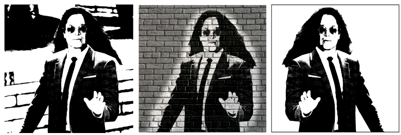
This design comes from one of my thumbnail sketches which represented the title of Black Sabbath's song, 'Age of reason', and my twist on it was that Ozzy (The lead) had found 'reason' after many years of being the Prince of Darkness, and that he is wearing a suit and has an office job, to show that Ozzy has reason a time in his life of reason.
I began with this large picture of Zak Effron in a suit, which I then knew I was going to impose Ozzy's head onto this character using photoshop methods.
I cut out a picture of Ozzy's head using the lasso tool, and also the eraser to neaten up the edges.
After quickly imposing the head onto the suit, I was pleased with that outcome.
I did the same procedure with a different suit to see if the outcome was better, I preferred the original.

Then using the threshold modes in photoshop, I adjusted the levels until I was happy with the contrast. It still contained a white border where the image had been, so I removed all of the negative space with the eraser tool which made the piece look like it had been sprayed onto a wall.
The final piece on this branch represents anarchy due to the spray paint execution, but I still feel my concept comes across as it is very unusual to see the Prince of Darkness wearing formal clothes, so that in it's self is quite shocking.

I shall take these designs to the crit to see how they could be further. 

Lorde single vinyl cover idea creation:

This design is a development from one of my thumbnail sketches.
It has been digitally created from moving forward after the thumb nail sketch.
I used illustrator to draw a single diamond using the line tool, and then filled in the seperate sections using selected colour swatches.
Once I was happy with the creation of one diamond, I simply created a grid and duplicated the shapes to form a pattern.
I experimented with changing the swatches of one pattern to see the outcome, which I liked, and arranged them into different patterns.
The composition was considered, and I varied the design from being constricted in a square format, to coming off the page in a bleed style.
This is an alternative pattern which the diamonds leave the page, but the pink ones have order.
I felt I would see what the shapes looked like in a circle format, which was eye-catching and appealed to me.
I then duplicated the circle to make 4 identical ones which touched on the central sides.

The diamond's sizes were adjusted to see what other effects I could achieve.
I then layered up the shapes and applied a blend mode of Multiply to see the outcome. 
I was very pleased, it had an illusion style to it which was unusual.
By playing around with the blend mode and the placement of the layer, I was able to make the diamonds fade into the illusion pattern, which was very appealing.

I intend to take this final branch of this design to the crit to see what feedback my peers have.
I am now unsure which direction to go in for improvement, so the questions that I ask in the crit will revolve around direction.