Showing posts with label type journal. Show all posts

Tuesday, 18 March 2014

Leeds uni of's school of mathematics

Silicone/digital/lead typeface

Examples of use: Leeds uni of's school of mathematics 
Production MethodDigital, Silicone 
Category: Sans serif
Classification: Humanist
Distinguishing Marks: Straight edges, similar to all sans serif + silicone fonts, Helvetica, Gil sans etc

Character: Bold, Sentence case, easy to read from a distance

Ec Stoner Building Leeds uni of:

Silicone/digital/lead typeface

Examples of use: Ec Stoner Building Leeds uni of
Production MethodStroke, brush
Origin: Similar to Rockwell
Category:Serif, Grotesque 
Classification: Humanist
Distinguishing Marks: Straight edges, similar to all sans serif + silicone fonts, Helvetica, Gil sans etc
Character: Fancier than sans serif yet still easy to read from a distance

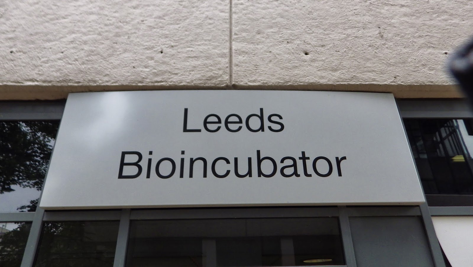
Leeds Uni of's Bioincubator:

Silicone/digital/lead typeface - Aerial, Helvetica etc

Examples of use: Leeds Uni of's Bioincubator 
Production MethodDigital, Silicone 
Origin: Computer created, Swiss
Category: Sans serif
Classification: Humanist
Distinguishing Marks: Straight edges, similar to all sans serif + silicone fonts, Helvetica, Gil sans etc

Character: Bold, block capitals, easy to read from a distance

West Wing, Leeds uni of:

Serif typeface:

Examples of use: West Wing, Leeds uni of
Production MethodStroke, brush
Origin: Similar to GARAMOND/ Garamond Bold 

Category:Serif, Grotesque 
Classification: Humanist
Distinguishing Marks: Straight edges, similar to all sans serif + silicone fonts, Helvetica, Gil sans etc

Character: Fancier than sans serif yet still easy to read from a distance

Lonsdale brand:


Slab serif typeface

Examples of use: Lonsdale's brand
Production MethodDigital, Silicone 

Origin: "No real identification ever made for LONSDALE logo. Not a font, apparently, custom made. Close to Rockwell Bold Condensed but O is too "squary" condensed, N has a serif bottom right end, D has a rounded belly, A has double-side serif top, E has a serif center bar aligned with the right ends to "squarify" the block-logo As far as i know, no Slab Serif Egyptian family font has all criteria all together." [http://www.dafont.com/forum/read/658/lonsdale]

Category: Slab serif serif
Classification: Humanist
Distinguishing Marks: Bold stroke, thick serif 

Character: Bold, block capitals, easy to read from a distance, powerful, punch, symbolic of the brand.


Manchester's China town sign:

Silicone/digital/lead typeface

Examples of use: Manchester's China town sign
Production Method: Digital, Silicone 
Origin:

Category: Sans serif
Classification: Humanist
Distinguishing Marks: Straight edges, similar to all sans serif + silicone fonts, Helvetica, Gil sans etc

Character: Bold, block capitals, easy to read from a distance