The Brief
"The name of the company is Tropics Foods Uk Ltd, we are based in the Leeds 7 area. We have been in the food manufacturing game for over three decades. We have many of our branded products under Tropics in stores such as Asda, Tesco and Morrisons. We also do lots of contract work and these are often under names such as KTC, Enco, Dunns River. Our website further explains and gives you a better insight in to our company.My aim is to launch 4 flavours of milkshake syrup mix, these are bottles of syrup which when mixed with milk creates a milkshake.
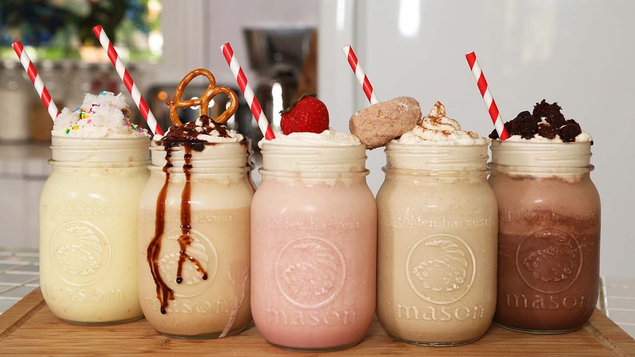
My product is based under the American diner menu, so it will look very 1950's in design. The front of the label will consist of a milkshake glass with a straw in it and a fruit on the side. I have many concepts that will make life for the designer much easy.
I have realised that the Graphic Artist department has many eager artists willing to undertake such tasks that will further enhance their portfolios.
Thank you, we look forward in working together with the college."
Contacting
It struck me that this brief didn't explain or even give the name of this milkshake product I was to be designing for, as far as I knew, the title of the product labelling would read 'Milkshake',Also another concern that arose was that at this stage, I did not know the flavours of this product, the brief explained how 4 flavours were to be released, the problem was I did not know these flavours.
Finally, the client explained how they had concepts that would ' will make life for the designer much easy' I was interested to hear what these concepts were and how the could benefit my designs, for this reason I finished by asking that question.

My email read:
"Hello there, I am Ryan Daley, A 3rd and final year of Leeds college of art's BAhons Graphic design course.
I have read the briefing email and have a few questions to ask about the product.
Firstly, you have mentioned that the product will come in 4 flavoured syrups? Please could you inform me as to what these flavours are.
Secondly, is there a name associated with this milkshake product? or is this something that the designer must design on?
Thirdly and finally, you have mentioned "I have many concepts that will make life for the designer much easy." do you care to expand on these concepts please?
Thank you very much for your time, I am looking forward to hearing back from you and beginning the brief.
Yours faithfully, Ryan Daley"


