Friday, 13 December 2013

Edible type, creating our idea

Having the idea to create the Swiss style typeface of Futura out of Swiss rolls, we gathered all the ingredients we thought we would need.
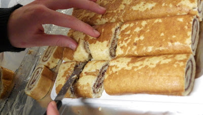
Once all of the ingredients were assembled, we were ready to cut out the shapes of Futura using 6 swiss rolls as a grid/x-height to where the letters should ascend and descend.
Having a copy of Futura on a screen close by, I cut out the swiss rolls using my own judgement, into S,W and I shapes, as well as then cutting out an aeroplane symbol.
Using a ruler, I established the width of the letterform so it kept a consistent stroke size throughout. 
Once the letters were full cut out, they were ready to be iced to achieve a smooth, clean Swiss style. 

Final photoframes mocked up

I have mocked up my final 3 photo frames by skewing the photograph so it fit into the frame and convincingly looked like photographic backing paper.

I have used many photoshop methods such as blend modes and other such tools, drawing blurred white lines over the image and then setting the layer to overlay made a believable reflection ontop of the glass, and drawing a line around the photograph which a brush tool and the black colour, it appears as if the backing paper is in the frame surrounded by the shadow.


I then created three mock ups with tag like things on black leather with a gold typeface.
Ideally I would have liked to print using foil blocking methods onto pieces of card with a black leather print on, but this process was time consuming and I never managed to get around to it before the end of the deadline unfortunately.


The typeface on my design has been informed and I chose it from a range of typefaces which feedback had been given by my peers in critiques of my work.
The black on gold effect had been carefully researched and I felt it represented Laura Ashley as a company, even though it was rather outlandish and brash.

Thursday, 12 December 2013

Attempting to create an alternate foil blocking technique:

Ideally, I wanted to use foil blocking methods to create a stylish and classy looking tag which would be situated inside the photo frame above the backing paper, but time restrictions have resulted in my not being able to use foil blocking techniques.
I had the idea to cut out the words I wanted using a scalpel, once the letters were cut out i'd use the scalpel as a stencil for spray glue to work around and then i'd use gold glitter to represent a foil blocking method.
I made an attempt at doing this, but unfortunately, enough glue didn't get through the tiny letters' holes which meant the gold glitter writing was unreadable.

I shall re-attempt this using bigger font to see the results:
With a bigger stencil, the spray glue got though the holes easier, but still looked rather messy afterwards. 
The colours are what I was going for in my design, but the messiness and untidiness is completely opposite, and wouldn't reflect Laura Ashley very well. 

Leather texture photographs:

Having been informed that taking your own photographs in adverse to using stock photos found on the internet is a lot more professional, I have taken my own photographs of a black leather texture.

Using a macro 1cm mode on my camera I have taken various photos of a leather texture of which I can use for my photoframe's backing paper. 
I used photoshop's editing effects to make the black leather look dark,rich and vibrant so it would be the best quality for my design to go on.
Using overlapping blend modes on photoshop, I have created an effect similar to the Heist's album cover.
I shall execute this method further but attempt to physically foil block my final type onto card with the black leather texture printed onto it.

Experimenting with Gold textures:

Once I had chosen a font which I was pleased with, I took it onto Adobe's photoshop to experiment with digital gold textures to see what feel they would have.

I used a process of isolating the black text from the gold background and cutting out the font.


The four images show the process of which I went thorough to cut the font away from the gold back ground.
I executed this process many times using different gold textures to achieve different effects. 
Using the process I have explained, I created many gold looking typefaces, some with high levels of detail and texture and others which are flat such as the gradient ones.

Monday, 9 December 2013

Developing design post interim crit:

Following on from the feedback from the interim crit, I have used the feedback I have recieved, I have developed one of my earlier ideas further, to present in the final crit and receive more feedback which will inform my design choices. 
I have stuck with the idea of using a ranging size of cameras to show the scale of the frames enlarging. 
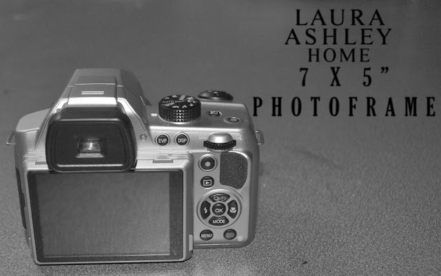
I have started with a small compact camera, which is the smallest sized that you can purchase.
Moving onto a bridge camera, which is medium sized. 
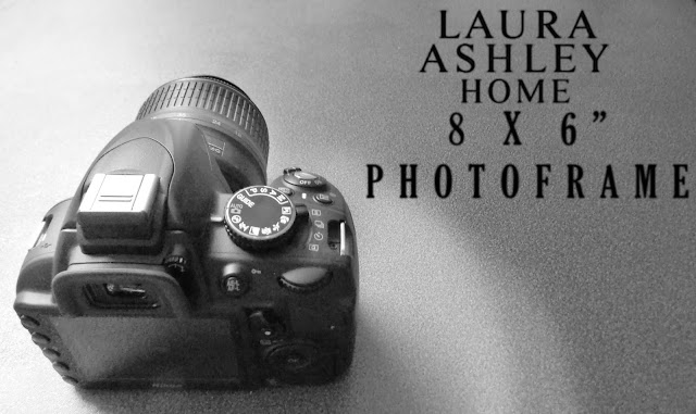
And finally a DSLR which is the largest camera possible. 

I have made my font choices based on the feedback from the initial crit, I have used the Laura ashley Logo to show which store this frame would be sold in once it was fully designed to a professional and functional level. 

Wednesday, 4 December 2013

Creating my designs from the interim crit:

I will explain how I have made use of photoshop to edit my images for use in the final design stages of this brief. 
Moving on from the interim crit, I picked up that B&W images generally looked rather high-end and classy, so I have chosen to go down this route with these photographs which I have taken. 
Initially I have desaturated the photograph, and then using Photoshop's levels, I have changed the balance of the photograph to ensure it is as visible as possible, and sets the best tone.
I explored the route of inverting the photograph to set a different tone of voice to the photograph, which could create a more arty and stylish vibe to the design. 
I finally used a serif font which is very similar to Laura Ashley's logo's font, and used the gaussian blur effect to reduce the sharpness of the font and let the typeface merge with the background. 

Interim crit feedback and future steps

After receiving lots of feedback from my peers at this interim stage, I am ready to develop my ideas in accordance to the outsiders' opinion on my designs.

Here are some of the comments I received from the critique:
  • High end idea is good but could potentially look tacky, print experiments could divert this.
  • Consider looking at high end fonts and research perfume design/ clothes.
  • Different type face for a high quality feel
  • Research colour/tone that communicates expense
  • Simplicity can communicate elegance
  • Doesn't have to be script to look expensive
  • Expensive imagery for an expensive frame
  • Marble looking background and serif font works
  • Grammar doesn't make sense in the design
  • Less text can equate to elegance
  • Research materials
  • Be more original
  • An elegant sans serif could be more useful
  • Use photography to communicate quality
  • Idea 1 works well, drawn in detail could be the route to go down
  • Make text 3D and textured
  • Try foiling
  • Use capitals 
  • Higher quality calligraphy font
  • Camera composition (idea 1) is weak, fill the space
  • Consider photographing camera or drawing with more detail
  • No1 is a concept not an idea
  • Make typeface relate to imagery 
  • Sans serif typeface
  • Aim for more individual font such as 'Exmouth'
  • Attempt foil printing
  • Design No4 doesn't fit audience
  • Design No2 is best for high class
From the feedback I have collected I feel I now know which direction to go down with my designs and which would fit the public's opinion the most to create a successful range of designs.
Ways in which I intend to develop my work:
  1. Research into High end sans serif fonts, perfumeries and clothing ranges.
  2. Look into minimalism but elegant designs.
  3. Experiment with paper stock and foil blocking
  4. Attempt some photography which relates to the designs. 

Initial ideas in preparation for the interim crit.

Creating mock ups of my ideas in preparation for the initial crit.
As the brief required a themed set of designs and it was to be used in conjunction with the sizes (eg. 4x6) and with the obvious connection of photo frames and photography equipment,  I used the different types of cameras that are available to show the increase in size of the frames.

Idea 1:


I have used simple illustrations of a compact, bridge and an DSLR camera to show a simple piece of photography equipment, as it is known that these cameras are varied sizes. This is a concept rather than an idea, and I feel it represents something I intend to create or use photographs to represent. 

Idea 2


Using these photographs as part of my backing paper, in collaboration with the other 2 ideas to see the results.

Idea 3:
Based on inspiration from The Heist album cover, I have used a calligraphy font against a black leather background to portray elegance and style, I feel this idea, if done well, will represent the higher end market very well.


Idea 4:
My fourth idea is a comical one to appeal to children or teenagers, and it is that the backing paper uses a man escaping from the frame by trying to break the glass, with a fearful look on his face. I haven't considered typeface yet for this design, and it goes down a different genre to the other frame designs.