Friday, 15 November 2013

OUDG403 PROJECT EVALUATION:

I regret starting this module off to a bad start in which I was unproductive, and didn’t realise the pace of which I would have to work, I was unproductive with my designing and blogging, and I feel I paid the price at the final stages.

Towards the end of the module I feel I massively upped my game and I began to enjoy blogging and was churning out good quality, informative blog posts at a very thorough pace, in comparison to the beginning.

The later projects, such as Message & delivery I feel at stages I excelled at, but my time management skills still managed to let me down, and certain parts of the project slacked. The alphabet soup project is my worst I feel, I am pleased with the final illustrator design and print out on A2, but for the earlier stages such as the 10 typeface variations, I managed to lose those before the first crit so was in a rush to reproduce those designs to have something to show in the critique.

After a few critiques, I understood the basis of them, and began to adjust my work in accordance to the feedback that I received from my peers, as I realised they reflected a target audience, and if they weren’t understanding the messages I was trying to convey, then neither would the public.

I have enjoyed researching various designers, and the lectures have given me an insight into new designers whom I hadn’t previously heard of, which I took into my on-going projects as inspiration to design.

In future modules, I now realise I definitely need to commit my self more, and I have now found methods in doing so, my pace of work vastly picked up during the final weeks, and I am sure that will now be my mentality which I shall carry through into the future.


I aim to produce thorough modules of work that will be academically intelligent as well as containing professional looking designs.

Wednesday, 13 November 2013

Imposing designs and adding context

I had the idea to impose my designs onto billboards to put them in context in the public domain.
 Using photoshop techniques, I managed to accurately skew my designs over blank billboards.
I edited the photographs to black and white to put more emphasis on the colour of my designs. 
I also took it upon my self to take photographs f the LCA exhibition/advertising space, and to impose me designs into these places, as if it was being exhibited. 


Monday, 11 November 2013

Image only design:

Based on the feedback from the interim crit, I was encouraged to take the design forward of where the audience of the newspaper is throwing it away in rebellion to show they can make up their own opinion.

Using this self taken photograph in relation to photoshop, I managed to edit the image in the same style as the previous one to create an image only design. 
The threshold levels were adjusted to create the same effect as before, and using the brush tool, blood was added to the piece of design.
The shadows in the image appear as an over exposed photograph, which is quite effective to set the tone of the design, and the addition of blood to the image gives a sinister feeling. 
I find the piece of design emotive, and it is evident that the character is discarding the newspaper rebelliously, but it has had an effect on the person, as the blood still remains on his hands.

Again, I chose to print the design on newsprint as I felt it was fitting for the project, unfortunately the print didn't come out perfectly, and there were damages/creases in the paper stock. 
I shall re-print the image and submit it for my final design. 

Final crit + further development:

After presenting my designs to the crit group, I had received feedback on which I could model the development for my final pieces, to make them yet more effective at displaying the message which I intended to communicate.

Simon, the lecturer explained to me how my blood hands design made use of a satirical story of a 'bun fight', and that it didn't fit with the tone of the piece, so I then went on to remove this story using photoshop, and replace it with the word 'Fight' to show how the news paper is based around violence and cynicism.


Also, the crit group made relevant the fact that the red, impact typeface contrasted against the colour in the background, so I have altered this aspect of the design. And also pointed out the fact that I had used the logos of the famous UK red top news papers in my design, and how it would be as effective without that addition. All of these pieces have been altered and adjusted to suit.
The design had now been edited to the feedback of the crit, and it was more fit for purpose than before.

Thursday, 7 November 2013

Printing my final typeface

After the induction to the Digital print room, I was ready to print my final typeface. 

I decided I wanted to print onto a professional, sophisticated cartridge type stock as I felt it would be very fitting for my Art Deco style typeface, and that the off white colour would fit the purpose of my font.

I was very pleased with the final print of my typeface, and the colours of the black worked very well against the texture of the stock.

My typeface looks very stern and solid in this form, as the strokes of black stand out very well and have a sense of dominance on the page.
The black border around the edge of the A2 page sets a boundary for the design and adds to the art deco style of my font.

I took photographs of my printed typeface from various angles, using different methods and then desaturated the photographs using photoshop as they didn't require saturation as they're B&W images.

I was very pleased with the final print of my typeface, and happy that I chose a more expensive stock to print the font on, as it gave it a better, more professional feel, than typical generic paper stock.


Newspaper project Crit

At a midway critique of my designs, I received plenty of Feedback on my current ideas. 
Quite a lot of the comments were that people didn't quite understand the message, which is understandable at this stage as my rough mock ups only represented the idea.
Another comment was that the person didn't like the typeface, but that isn't an issue at this stage as it was the very first crit of my designs and I didn't necessarily consider typography. 

I will use the feedback from the crit in conjunction with my designs in an attempt to develop them using the comments left by my peers. 

Blood on the hands of a newspaper reader

I am following through with the idea of news paper readers feeling like they have blood on their hands after reading the famous red top newspapers, or any British tabloid. The feel as if they have blood on their hands due to all the horror and violence reported about every day
Using photoshop, I developed this initial photograph into two layers of separate colour, one being red the other being black, and it became a valid, two colour piece of design. 
I have chosen then font Impact as I felt it was very similar to the type of font found on a newspaper cover, and also because it has a very strong presence on my design, and wasn't overshadowed by any other typography on the page.
I chose to print my final type and image design onto newsprint paper as it is based on the newspaper project, so it felt like the most fit for purpose stock to use. 
I was happy with the print outcome on newsprint, and I feel it has strayed away from the generic white background of 80gsm paper. 


Wednesday, 6 November 2013

Photographic representation of my design

Following on from my design based on the news papers metaphorically subjecting their views to blood on their hands, due to the overly violent stories reported in British press. 
Using the brush tool in photoshop, with certain enhancements added to it created a blood like effect when editing a photograph. I shown this by using a distinctive famous 'red top tabloid newspapers' and signalling the blood running down from the header onto the reader's hands.
I feel this mock up reflects how I would like my design to look very accurately, and I intend to create a two colour design showing this idea to the greatest extent. 

Experimenting with Type as image:


 Having done a small amount of research into type as image, I decided to make an attempt at creating my own.

I selected Times as my font of choice due to it's very obvious connotations with newspapers, and I thought it'd be interesting to experiment with a serif as type with image.
I adjusted the tracking of the font so the letters in my word were all touching, as I felt that was a good start to creating type as image. the resulting figure of the tracking was at a figure of -145.
I used Photoshop's grid tool to add my own imaginary x height to my word where I then used to eraser to remove anything that wasn't in line on the cap of the capital N. 
Using the Polygonal lasso tool, I extracted certain aspects of the word (mainly the lower serifs) in an attempt to enlarge the size of some of the font and distort the image thoroughly. 
I then went on to adding an extra line of "Getting too big for their boots?" as the serifs represent shoes as they're on the feet of the letters, and as the words Newspapers is much bigger than the other type it shows a sense of arrogance and also heir achy, as it's the largest thing on the page. 

I used the blur tool on the sentence with the question to make it appear similar to the Newspapers line.

Tuesday, 5 November 2013

Initial Ideas

Based on the research into newspapers, I have come up with some initial ideas to present in the critique on Wednesday.
My ideas have been very quickly sketched up digitally, as I feel the first crit should reflect the idea process in adverse to the style of design, professionalism I would like my final pieces to look like. 
This idea works purely on image, and it represents a reader of the tabloids highlighting words in a newspaper, the words that this person is highlighting are all words that I feel the newspapers use to cause fear and intimidation in the press. The words of scaremongering that this 'character' is highlighting will have an impact due to the amount of the words, which will signify how newspapers use such techniques. 
This is a design that works using only image (despite the Tabloid's name), and it represents the fact that newspaper readers could feel the blood on their hands, as I feel newspapers hold very overly violent stories, and are filled with depression and anger.
The Sun's infamous red banner is leaking on the reader's hands, which I intend to signify a blood like substance, to show how the drama,distress and terror found in newspapers reflects onto the audience.
My final initial idea is of a newspaper reader throwing a scrunched up newspaper over their shoulder, so they can be free from the newspaper forcing their opinions on the audience. I intend for this idea to make use of type and image, but at this stage, the type hasn't been massively considered, in terms of placement, font, size 
or colour, but I feel it conveys the type of tone I wish to portray.
Initially, I have chosen a slab serif font of Rockwell, as it is strong, decisive and stern, which works well with a solid, instructive command. 

My mock ups are very basic at this stage, but it shall be the crit which will give feedback on my design ideas, after which I shall then concentrate on designing professional and effective looking pieces of design, hopefully with a strong message to accompany it.

Monday, 4 November 2013

Editing 8 letters - Bookman Old style font.

Bookman Old style
"This family includes 10 fonts in 5 weights, with complementary italic. OpenType features include small caps, 680 swash characters, 35 optional ligatures, lining and old style figures, full f-ligature set, alternate characters, automatic fractions, automatic ordinals, 6 stylistic sets."

"Bookman or Bookman Old Style is a serif typeface derived from Old Style Antique and designed by Alexander Phemister in 1858 for Miller and Richard foundry. Several American foundries copied the design, including the Bruce Type Foundry, and issued it under various names. In 1901, Bruce refitted their design, made a few other improvements, and rechristened it Bartlett Oldstyle."

I particularly like this slab serif font, and even more when it is in a bolder form. I feel it appears as a very formal looking, professional font, which commands a lot of respect due to it's individual, solitary standing.
The line weight on the font when bold is a very thick stroke, which follows the letter round to create a weighty font with a strong presence.

Creating my partner's name badge

Using the earlier photograph of my final design drawn out, I took the image onto Adobe's photoshop and cut out each individual letter of Tom's name. 

 I then used the threshold tool to remove the photograph and make a vector looking piece where the glyphs are.
I sized the badge down to the correct size, 40mm by 90mm, and created a bounding box which was the correct size.

After printing I shall Mount the name badge onto card and it will be complete.


Partner's typeface, final creation

 Having moved on from the graphite pencil creation, I used a graphics pen to create this piece which is a more abstract, and less cluttered version of the graphite pencil piece.

The lines represent movement and also unclarity, due to the fact that Tom is 'Visually impaired', and the movement aspect comes into play because he feels he should be less trusting and move away from people.

Experimenting with a vision idea - traditional mediums

Using graphic pencils and the Franklin Gothic book typeface I smudged the graphite to the right to show blurriness, loss of vision and also movement.

I then scanned the piece in using the A2 scanner.
The contrast of the graphite reacts to the paleness of the white A2 paper, which allows the coarseness of the graphite to smudge and create a dragging effect.
Using threshold on photoshop  I have darkened the graphite lines to show the movement as a solid block colour. I feel this represents movement and also blurriness/double vision at the same time, which are two traits I have now chosen to represent Tom, Blurriness due to his need to rely on glasses, and movement due to the fact he would like to be less trusting, so he should move away from certain people.

I have an idea of how I can progress this design forward, and I feel it will make an effective piece of typography which represents Tom, and is also aesthetically pleasing.


Experimenting with a vision idea:

A part of Tom is that he wears glasses to see to his best ability. 
Myself experimenting with glasses explained to me that the aid short sighted or long sighted visual impairments. 
I have generated various experiments which focus around vision, blurred vision and blurriness. 
This experiment created on photoshop revolves around layering the images and changing each of the most forward layer to a slightly lighter tone which creates an effect of the word travelling into the background. I feel to an extent this could reflect visual impairment but more so inebriation.

Here I have created multiple experiments by adjusting the spacing between the lines of a sentence. 
As each lines comes closer to the other and they merge into one, it can become quite baffling on the brain, and create a typeface of it's own, which makes use of many lines and bowls of the letters. 
I chose to use a range of adjustable levels when editing the spacing as each quantity had a more rational/irrational effect.
This is an idea that I could carry forward as it does make a very aesthetically pleasing looking typeface, and I find it quite inventive. 
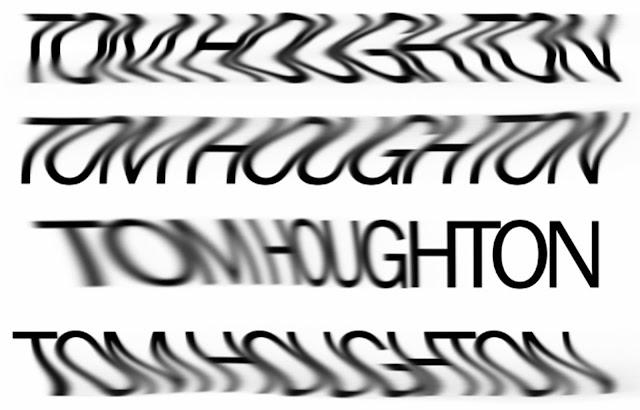
These 4 different experiments are a result of using Photoshop's blur tool on a rasterized layer of Tom's name. I love how the lines curve and bend, this adds a certain personality to the font alone. Again, this result is similar to the effects of inebriation on the eye, although I do feel it looks very unique and creative.

Franklin Gothic book research

Having chose Franklin Gothic book as my font which I shall edit to become more fitting of Tom's personality, I have chosen to research the font to ensure it has no connotations which wouldn't relate to Tom as a person. 
"Franklin Gothic and its related faces are realist sans-serif typefaces originated by Morris Fuller Benton (1872–1948) in 1902. “Gothic” is an increasingly archaic term meaning sans-serif. 
Franklin Gothic has been used in many advertisements and headlines in newspapers. 
The typeface continues to maintain a high profile, appearing in a variety of media from books to billboards. Despite a period of eclipse in the 1930s, after the introduction of European faces like Kabel and Futura, they were re-discovered by American designers in the 1940s and have remained popular ever since."

Franklin Gothic is an extra-bold sans-serif type which can be distinguished from other sans serif typefaces, as it has a more traditional double-story g and a. Other main distinguishing characteristics are the tail of the Q and the ear of the g. The tail of the Q curls down from the bottom center of the letterform in the book weight and shifts slightly to the right in the bolder fonts.

I feel that Franklin Gothic is an accurate choice of typeface for Tom as it is a body copy font which is very similar to Helvetica, and it can easily be manipulated to portray the personality traits which I desire it to.

Altering the fundamentals of type:

Using Adobe's Illustrator, I loaded up a range of my fonts which I felt suitable for Tom, and adjusted various aspects of them, including the weightleadingtracking and kerning. 

Copper plate
Copper plate had quite a reaction when I altered the weight of the fonts, the lighter option for Copper plate made the typeface look skeletal, and rather similar to Times new roman in certain aspects. 
The bold option made the font look very heavy and weighty, almost like a slab serif, this could be quite useful as an experiment. 
By altering the tracking of the font by -200 points, it had a powerful effect on the fundamentals of this typeface, I do like how the font comes across and feel that reducing or increasing the tracking of a font vastly alters the personality of a font. 
Consolas
Similarly to editing Copper plate, adjusting the weight of Consolas makes it much more of a block typeface, which looks more sturdy and solid. 
as the tracking of the font was negated in this instance, the letters began to overlap each other which was very interesting and gave a lot of additional personality traits - something which I would like to work with further.
Massively raising the tracking resulted in the letters becoming very spaced out and looking distant from each other. 

Franklin Gothic book
Franklin gothic book had the option to make the font italic which had instants results on the personality traits of the font, I feel italic makes the font seem indecisive of it's self and 'wavey'.
The adjustment in tracking of this font has big effects due to how blocky and square it is, lowering the tracking makes the letters clash and infringe in each other's space.
I find the adjustment of tracking -200 very interesting in this font as the letters are touching and are fighting the cling onto legibility.
Consolas
I find the uppercase G in Consolas very interesting and individual in the way all of the other letters in this sequence follow an x-height and this uppercase G finds a way to descend.
Again, lowering the tracking by -200 makes for a very interesting results which I feel I will follow through to the end result.
Brittannic Bold
Due to this font already being bold, there is no bold option to adjust the weight. 
Adjusting the tracking into the negative figures makes the font rather illegible and indistinctive to read.
Raising the tracking of the font spaces the letters very far which makes it appear as if the letters are solif and standing alone.
I don't think i'll be experimenting with this font anymore as it isn't fitting the objectives I intend to achieve, or reflecting Tom's personality.  
Conclusion:
Adjusting the tracking on fonts has given me realisation of how much a font's personality can truly be altered, and I now see the broad way in which personality traits could be added to a font.
I think I will go with the lowering of the tracking which brings the characters closer together, which I feel reflects how trusting Tom can be.

Final Design and improvements (Post Crit):

After hearing the feedback other groups and peers gave us, we changed the whole theme of the design as we were informed that the colours were too similar to a hospital's colours, for this reason we changed the scheme to a darker blue and also introduced a bright pink aspect. 


I was very pleased with our final design, and felt it worked very well to accomplish the objective that we set out for it to do. 
The colours were now very unisex and the entire product was bright, eye-catching, ergonomic and most of all, useful.


Improving the design pre-crit:

We decided to further improve the design in an attempt to make it more eye catching, appealing and also fit for purpose. 


At this moment in time, we were very pleased with our design and felt it was doing a very good job of demonstrating the most efficient route to LCA to a Fresher.
As we had spent a while as a group designing the piece, we felt we needed outside opinions about how it could be improved.