Here I am deconstructing the typography found in a magazine's spread to show how Hierarchy works concerning fonts and typography. I will be looking out for larged pointed fonts, thick bold sans serifs and large areas of body copy as they are the most eye catching examples found in a magazine.
This page in a magazine advertising Bloomsbury books is one which is filled with body copy, headers, footers and promotional offers about the company. Perfect for this construction about hierarchy.
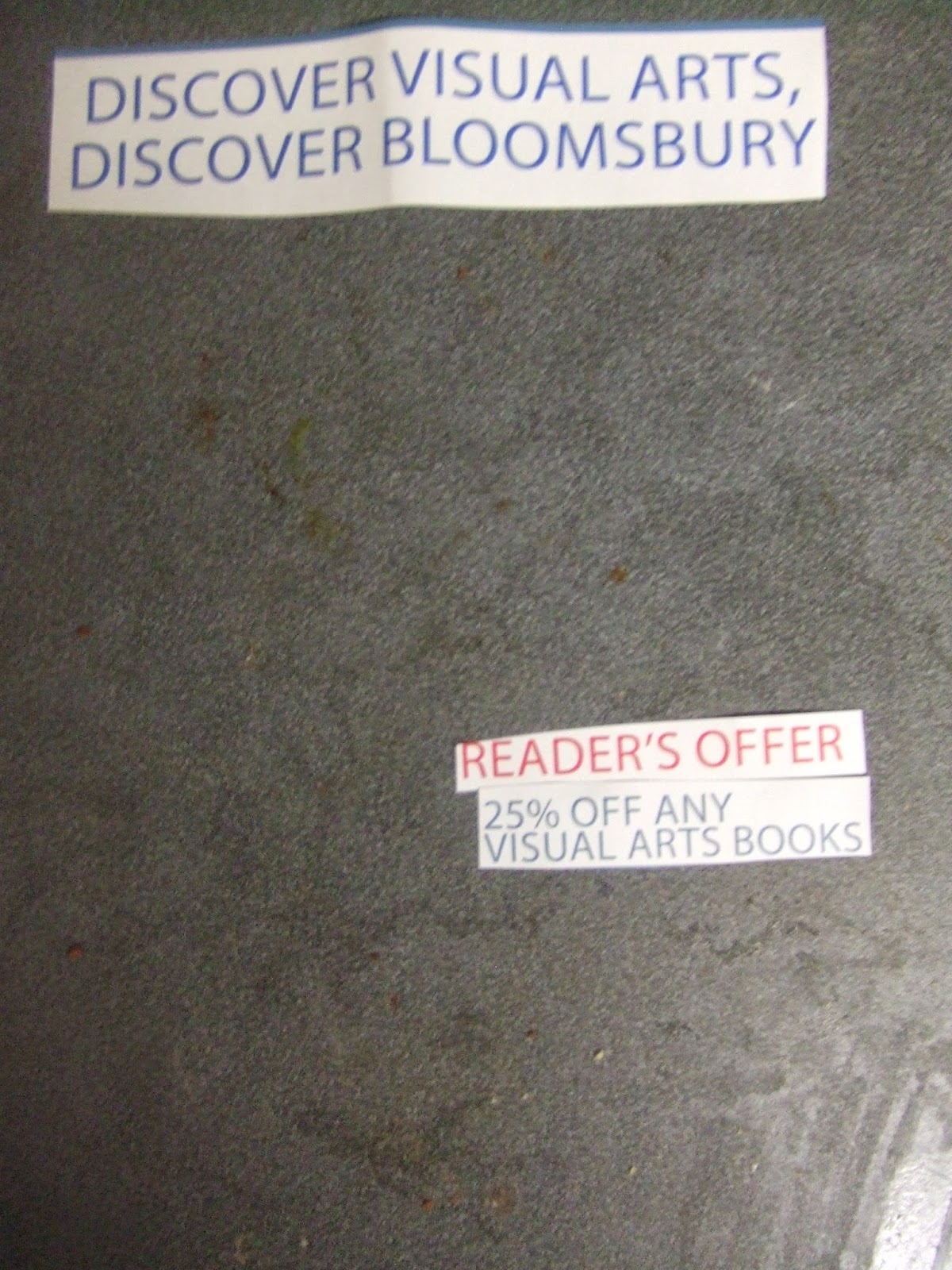
Starting off with the header on the page, the piece of type which viewer's eyes are immediately drawn to, the ideal function of a header in context. The name of the company is involved and their tagline which is: 'Discover visual arts, Discover Bloomsbury'.
Once the company has introduced it's self to you by saying their name and tagline, they hit you with why they want you're attention, because they have an offer for the reader. The reader is you.
Found in a clean cut gothic though, which makes use of a pungent red tone, famously the most eye catching colour. Bloomsbury have done a perfect job of introducing their selves and hitting the audience with the offer at hand.
The second part of this proposition is what the company are offering you today, the viewer at this stage already knows about which company it is, what they have for you and now they're about to feed you what is in this for you.
'25% off any visual arts books' continuing from earlier's introduction and carrying on down the 'visual arts ' route, this line is supposed to engage the audience and put them on the edge of their seats, ready to receive their 25% off.
The 4 piece in this hierarchy tree is the explanation of HOW you can be part of this offer, visiting their site with a code in hand will enable the customer to receive 25% off.
As you can see here, the weight of the fonts begin to drastically lower as the hierarchy goes on, now at a low weighted font to disclose the information which the viewer has to find themselves.
This piece covers an explanation of what the company does, a simple way to reaffirm that it is a good idea to make use of their offer and they should strike. This information fills in the gaps for new viewers whom may not be in full understanding of what the company does and what they could benefit from having 25% off. Similar font weight to the section above with the offer, in that sense the creator of this advert must have left it up to the viewer to decide which piece they wanted to read first.
Now comes a tiny piece of body copy font, located above the header which shows significance, but in this instance, the location is under shadowed by the size of the font, couldn't be no larger than pt size 14, for a section of information which would require close attention to be paid to understand what it says. A device used by companies to fill in the blanks which they didnt ideally want the customer to see, small print is what it's called.
This next piece of font hierarchy include the company's name and logo, something which doesn't have to be introduce until later due to the audience already knowing the name of the organisation.
Here the logo serves a purpose as a seal of approval, to re affirm to the viewers that this is a genuine offer and a genuine company.
The next piece of type covers another statement of what they do and what you need them for, another hook when it comes to typography, 'photography teaching essentials'.
Found in a white font against a blue background, this stands out, the fact that the point size is tiny makes it hard to see and read though.
Found in a white font against a blue background, this stands out, the fact that the point size is tiny makes it hard to see and read though.
Here shows size typographic order of the fonts found on this page, not necessarily the order of power of hierarchy but the pt size list of each font.
This shows the final product after the page has been scrutinised and each piece of typography has been removed. The imagery left shows nothing to the audience, it doesn't explain what the company is or what is being sold, it is just imagery which should be complimented by language.
I feel this was a valuable exercise in understand how powerful typography can be, and how much impact it can have on an audience, I have learnt things I didnt before know or have knowledge of, and I have found this a valuable lesson.


No comments:
Post a Comment