Friday, 28 March 2014

Preparing negatives for screen printing:

Currently, I have developed this design into this piece, the foreground consisting of portraits of the 3 main characters in a halftone way, the background should reflect the 'stolen Sats papers' falling and also various paper aeroplanes as it's a school based film.
This collection of layers will be all in one colour which will be a lime green to reflect school following on from my research, I felt that the typical crimson or royal blue would be very gender subjective, where i'd class this film as one that would be unisex, and gender diverse. 


The Type Monaco, which is a gothic font, is one I chose as I felt it slightly reflected school and a formal, clean cut way of reading text. It has been commented on that this font has connotations to school and education etc.
I have chosen for this layer to be in a crimson red colour, to contrast with the green, I also would have liked to over lay the crimson colour over more of the design, to represent the bullet shots from the paintball gun and leave the movie cover very ambiguous and open to interpretation.
So far, I haven't managed to create this part of the design, so I possibly may just leave the outcome how it is. 

I felt the final outcome would look very detailed as a screen print, but in an effective way, in theory, the only pieces of high detail are the character's faces, which are half toned photographs. 

Monday, 24 March 2014

Halftoning my photograph

Having received feedback from my peer group and found direction to proceed forward with, I have chosen to commence with firstly creating a digital mock up of what I'd like my final screen print to look like, then finally to create the negative image which I will be taking to the screen print workshop.
 I began with my large scale 300 dpi image in photoshop, and following a guide [http://www.wikihow.com/Create-a-Halftone-Effect-in-Adobe-Photoshop-7] I used a method to turn my photograph into a halftone image.

Experimenting with the DPI, Frequency and angle creates varied results for the final design product, which I can experiment with later in the future.
This is the final photograph after it has been turned into a grey scale, bitmap Halftone image, this could now be used to create an almost photo identical screen print, a method which I will use when creating my movie poster.

Studio brief 3 Interim crit:

I have taken 3 sketches to my interim crit of Brief number 3.
These sketches are simply in pencil and the colours represent the choice of paint which I would use for my two colour screen prints.
Here I will document the feedback which I received:
  1.  Simple yet effective, try to use USA colours to present the President.
  2. Could make it tongue in cheek.
  1. Try playing on the idea of high school more. Images such as paper aeroplanes, textbooks etc.
  2. I like number 2, could you try and develop it to link more to the film? 
  1. This person agrees with "Try playing on the idea of high school more". Also look at 'assassinating' school related things such as paper bomber planes and such.
  1. Look more into the connotations of Assassins and link them together.
  1.   Assassin concepts might put off an older audience, this person likes idea 2.  
  1. I like the green one, you could achieve this effect by utilising half tone effects.
  1. The gun will work best, just a simple line vector could look nice shadowed with two colours. 
  1.  Design 1 is done well however I think it should incorporate the target element from design 3 slightly smaller onto design 1 to make it clearer of the film's content.
  1.   The gun would be a nice poster if it has high levels of detail.
  1. I like the green one the best, it'd be cool if you used neon colours and very minimal drawings.
  1. I like the green one the best.
  1.  Neon green would work really well.
Conclusion:
That is all the feedback from my peers which I received from the interim critique. 

From reading the various people's feedback, it has given me an insight into what is working from these 3 designs and what isn't.

I appricate that the film isn't very popular or well known so from this, I can imagine that my peers haven't seen the film, heard the title or seen the current movie poster, for this reason it gives me many non bias pieces of feedback on my sketches.

Actions to the feedback:
I don't feel I'd use the USA colours as recommended by someone as it would put too much of a patriotic slant onto an average American film. The president in the title is a student president of the school and not president of the US.

Not sure how tongue in cheek I'd like the movie poster to be, the age of the film is based at 15+ year-olds which could create a fine line between amusing and patronising which could kill off the levels of appeal to the target audience. 

The idea of the high school images and also paper aero planes bombing etc was one that jumped out to me, that sounds like quite a unique idea which could be experimented with.

People found the green half tone images very appealing and possible in a neon green also, I could try experimenting with this but I don't feel particularly a 'Neon' green would be that fitting, but I can obviously experiment.

My peers told me to vectorise the gun in further detail or simplify the idea but I think that the gun is my weakest sketch and it doesn't necessarily represent the film properly, it could be the poster for any action film involving sniper rifles and this film in individual in the aspect that Bruce Willis isn't a gun wielding Mercenary like in most of his hits, I wouldn't want to convey the wrong message.

Moving forward:

A play on the initial design 1 but using the aiming system from the 3rd sketch, and the scene from the film which characters get paint balled, could be effective and interesting to see green used with red.\

Experiment with neon colours.

Potentially vectorise the sniper rifle gun idea, yet I have explained why that isn't the design route which I'd go down.

Tuesday, 18 March 2014

Leeds uni of's school of mathematics

Silicone/digital/lead typeface

Examples of use: Leeds uni of's school of mathematics 
Production MethodDigital, Silicone 
Category: Sans serif
Classification: Humanist
Distinguishing Marks: Straight edges, similar to all sans serif + silicone fonts, Helvetica, Gil sans etc

Character: Bold, Sentence case, easy to read from a distance

Ec Stoner Building Leeds uni of:

Silicone/digital/lead typeface

Examples of use: Ec Stoner Building Leeds uni of
Production MethodStroke, brush
Origin: Similar to Rockwell
Category:Serif, Grotesque 
Classification: Humanist
Distinguishing Marks: Straight edges, similar to all sans serif + silicone fonts, Helvetica, Gil sans etc

Character: Fancier than sans serif yet still easy to read from a distance

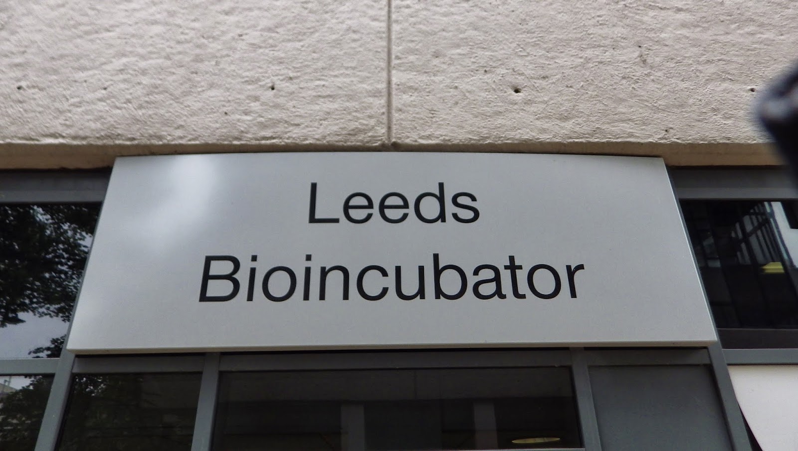
Leeds Uni of's Bioincubator:

Silicone/digital/lead typeface - Aerial, Helvetica etc

Examples of use: Leeds Uni of's Bioincubator 
Production MethodDigital, Silicone 
Origin: Computer created, Swiss
Category: Sans serif
Classification: Humanist
Distinguishing Marks: Straight edges, similar to all sans serif + silicone fonts, Helvetica, Gil sans etc

Character: Bold, block capitals, easy to read from a distance

West Wing, Leeds uni of:

Serif typeface:

Examples of use: West Wing, Leeds uni of
Production MethodStroke, brush
Origin: Similar to GARAMOND/ Garamond Bold 

Category:Serif, Grotesque 
Classification: Humanist
Distinguishing Marks: Straight edges, similar to all sans serif + silicone fonts, Helvetica, Gil sans etc

Character: Fancier than sans serif yet still easy to read from a distance

Lonsdale brand:


Slab serif typeface

Examples of use: Lonsdale's brand
Production MethodDigital, Silicone 

Origin: "No real identification ever made for LONSDALE logo. Not a font, apparently, custom made. Close to Rockwell Bold Condensed but O is too "squary" condensed, N has a serif bottom right end, D has a rounded belly, A has double-side serif top, E has a serif center bar aligned with the right ends to "squarify" the block-logo As far as i know, no Slab Serif Egyptian family font has all criteria all together." [http://www.dafont.com/forum/read/658/lonsdale]

Category: Slab serif serif
Classification: Humanist
Distinguishing Marks: Bold stroke, thick serif 

Character: Bold, block capitals, easy to read from a distance, powerful, punch, symbolic of the brand.


Manchester's China town sign:

Silicone/digital/lead typeface

Examples of use: Manchester's China town sign
Production Method: Digital, Silicone 
Origin:

Category: Sans serif
Classification: Humanist
Distinguishing Marks: Straight edges, similar to all sans serif + silicone fonts, Helvetica, Gil sans etc

Character: Bold, block capitals, easy to read from a distance

Research into RGB and CMYK:

RGB can't be made in CMYK, how is that decided?

"Many graphics software programs give you the choice to work in either RGB or CMYK. These are called "color spaces". Scanners and digital cameras create images using combinations of just three colors: Red, Green and Blue (called "RGB"). These are the primary colors of light, which computers use to display images on your screen. Printing presses print full color pictures using a different set of colors, the primary colors of pigment: Cyan (blue), Magenta (red), Yellow and Black (called "CMYK"). This is "4-color process" or "full-color" printing that comprises the majority of magazines and marketing materials you see every dayAt some stage your RGB file must be translated to CMYK in order to print it on a printing press."

""It's Best If You do the RGB-to-CMYK Conversion of Your Images You will have more control over the appearance of your printed piece if you convert all of the images from RGB to CMYK before sending them to us. When we receive RGB images, we do a standard-value conversion to CMYK, which may not be perfectly to your liking. We want you to be happy, so please, take the time to prepare your file properly. We cannot be responsible for sub-par results if you furnish your images in RGB. Even though monitors always use RGB to display colors, the colors you see on your monitor will more closely match the final printed piece if you are viewing them in the CMYK color space.

Be aware that it is possible to see colors in RGB that you can't make with CMYK. They are said to be "out of the CMYK color gamut". What happens is that the RGB-to-CMYK translator just gets as close as possible to the appearance of the original and that's as good as it can be. It's something that everyone in the industry puts up with. So it's best to select any colors you use for fonts or other design elements in your layout using CMYK definitions instead of RGB. That way, you will have a better idea of how they will appear in your printed piece. Here's a common example: many programs translate the 100% Blue in RGB into a somewhat purple-looking color in CMYK. We recommend a CMYK value of 100-65-0-0 to get a nice clean blue. Working in the CMYK color space allows you to select the CMYK recipe, or "screen build", that gives you the results you want. Here are some examples of how various RGB colors convert to CMYK:
[http://www.printingforless.com/rgb-cmyk.html]

What is the difference between RGB and CMYK color models?

When you  export a graph (or layout) in some formats, Prism lets you choose between RGB and CMYK color models. The two are not quite the same.
Differences between RGB and CMYK
RGB is based on projecting. Red light plus Green light plus Blue light all projected together create white. Black is encoded as the absence of any color. 
  • CMYK is based on ink.  Superimpose Cyan ink plus Magenta ink plus Yellow ink, and you get black, although this format also encodes Black (K) directly. White is encoded by the absence of any color.
  • Prism uses RGB internally. Exporting in RGB will give you results very close to what you see on screen.
  • Even though it uses one more number to encode a color, the CMYK scheme encodes a smaller "color space" than does RGB.
  • When a color is converted from RGB to CMYK, the appearance may change. Most noticeably, bright colors in RGB will look duller and darker in CMYK as shown below (from here). You'll find a more elaborate comparison here. 

Recommendation
Use RGB if you can, as there will be fewer surprises. The colors will closely match what you see on the Prism screen (which internally uses RGB). Select CMYK, only if you are submitting to a journal, and they insist on CMYK. If you export in CMYK, you'll need to check that the resulting colors look ok.


[http://www.graphpad.com/support/faqid/1282/]

[http://www.brighthub.com/multimedia/publishing/articles/21251.aspx]


B5 grid layout:

Creating a B5 grid layout for my publication, I chose to include 6 columns on each spread and 3 rows. 
Measurements were crucial to ensure a correct balance on the spread which worked properly.


Fred's colour theory No.1

Over the Christmas break, we were instructed by Fred Bates, individually to bring in a certain colour of object.
I was informed to bring in green items.
The purpose of this exercise baffled me until I arrived there and everyone in the class was instructed to place their objects together, ranging from Purple-Red-Blue-Yellow and Green.
After these objects were displayed in a large circle spanning the tones of colour, it created a very beautiful range of colours, which functioned like a spectrum/rainbow.

I took panoramic images on my camera to show the full scale of the colour range.
I also stood on a chair and took a photograph of the large scale photograph.


 These photographs make use of HDR mode which I find brings out the colour very vibrantly.

 After we were instructed to chose objects from our group's green selection with requirements in mind, the most pure colour, the darkest tone, the lightest shade etc, then we were to use the Pantone colour swatches to perfectly match the colours to each other. I learnt that there are 2 different types of Pantone swatches, one for un-coated objects, and the other for coated. Meaning Matt or Glossy.
I felt this lesson gave me a really good insight into colour theory and pantone swatches, I learnt many different terms to describe colours.

Typeface definitive choice:

After editing the different typefaces in adobe Illustrator, it made me decide that I want Franklin Gothic Book to be my final choice, which I will develop further into "Tom's Typeface".
Here I have shown Franklin Gothic book font next to the 6 glyphs which will also need editing to become the final typeface font.